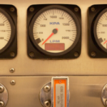
Think of the dashboard of your car and all the information it displays to you about the vehicle you’re driving. You have a speedometer to indicate how fast your traveling, which allows you to make sure your complying with local traffic ordinances. You have a fuel gauge to keep you informed about how much gas you have left in the tank so you know when you need to refuel — some modern cars even estimate the mileage you have left. And then of course there are indicators, such as the dreaded “check engine” light.
Originally intended simply to protect the driver from mud and other debris “dashed up” by horse hooves, and later the heat and oil from the engine, the dashboard became a convenient location for the modern instrument panel. All this data comes from a variety of sources — the engine, the fuel tank, etc. and is placed in front of you in a location that’s convenient to scan while you keep your eyes primarily on what should be your main focus, the road ahead. .
This sort of instrumentation panel, which makes it easy to determine the state of the overall system at a glance, is the sort of real world device any system trying to display real time data may want to emulate in order to quickly and effectively surface relevant data (including critical alerts).
What is JClass Guage?
JClass Gauge is an internationalization ready component written entirely in Java that allows you to do just that through the combination of indicators, circular and linear gauges as well as graphs that it can render.
Indicators
Indicator gauges are used to show a value within the context of a range of values. When the value assigned to the gauge enters a new range, the icon changes to reflect the color, image, and/or text associated with that range.
For example, you may have an indicator gauge that you want to use to assign a rating of poor, fair, and good depending on whether the value you’re measuring falls into certain ranges. You can tie such a status to icons that quickly communicate which status the gauge corresponds — such as a frowning face for a poor result, a face with a neutral expression for a fair result, or a smiling face for a good result. Alternatively, such an indicator could use a familiar metaphor such as a traffic light with red, yellow, and green colored swatches.
You can also create a panel of indicator gauges to show the status of multiple sources of data being monitored. In a simple case the gauges could encode the state of their data sources as a bit array, where each gauge in the panel can represent a value of one or zero (described in the JClass Gauge API as “unichrome” or single color). Such a “binary” indicator could represent a sequence of on/off states, not unlike the lights on your dashboard such as the Engine Temperature Warning or the Check Engine Light.
A binary indicator using yellow and blue
Alternatively with “multichrome” indicators you can display a range of values for each status being displayed, allowing for more nuance with different states. Imagine a dashboard for showing the status for orders within a shipping system. For that sort of application a range of values could indicate orders in process, being shipped, successfully delivered, or failed.
Four states of an indicator gauge that uses color to highlight health status
Gauges may be customized in a number of ways. The number of indicators, the direction (horizontal or vertical) and the sort of tool tip as to what a value means may be set. You can also provide custom images for your gauges and you can even make gauges blink to draw particular attention to the status.
Circular Gauges
Circular gauges present a value in the context of a circular graduated scale. You use indicators or needles to point out values on the scale. You can use circular gauges to give your application the look and feel of an automobile instrument cluster, airline cockpit, old time radio dial, and so on.
To use the gauge to show values from your application, you set the value on a needle or indicator object. This value can be static, dynamically calculated by your application, or chosen by the user. By default, a circular gauge is a complete circle. If you want to use only a portion of a circle, you can specify to use a half or quarter circle rotated in various positions.
The background color or an image may be specified along with the size. You may add multiple needles of varying length and there are a variety of built in options for the needle’s appearance to choose from. You have control over the angle where you scale starts and stops in addition to the units of the scale and how tick marks on the scale are labeled.
A Half Circle Gauge and Options for Indicator Needles
Additional text may be placed on top of the gauge as labels. Alternatively you may define a range that covers a portion of the circumference of the gauge, either inside or outside its boundaries — for instance if you wish to indicate a “low fuel” section of a fuel gauge. JClass Gauge even supports a case where the display shows a smaller circular gauge within a larger one, such as a stopwatch whose larger scale counts off seconds and whose smaller scale indicates the number of minutes that have elapsed.
A Gauge and its Configurable Sub-Components and Gauge Within a Gauge
Linear Gauge
Linear gauges are similar to circular gauges and has many properties in common, but are simpler in that they only present a value in the context of a vertical or horizontal graduated scale. Linear gauges can be made to look like thermometers, jazzed-up progress meters, and level/volume indicators.
An Example Linear Gauge
Graph Components for Gauges
JClass ServerGauge also comes with a light-weight graph called JCServerGraph. The graph displays the relative fluctuations in a changing value and can be placed in a panel or layered on top of a gauge.
Unlike the graphs part of the JClass Chart component, these graphs are not intended to be used as scientific tools. These graphs do not display scale values nor do they store a history of the values used in plotting the graph. Instead, these graphs are useful as a guidepost to how much or how little a value indicated by another gauge component fluctuates. As the gauge value changes, the graph line marks the relative change.
A Standard Graph and Graph Placed On Top of a Gauge
You can change the direction in which the graph line travels and the graph’s upper and lower boundary values. The size, line color and other properties are also customizable, as well as the distance between value points in the graph.
Conclusion
JClass Gauge provides powerful options for adding instrumentation to your applications to surface mission critical information to enable decision making within your organization. With a variety of form factors and configuration options you can create a rich user experience tailored to your needs.
For a limited time, we are offering a free upgrade to JClass Gauge for current Quest JClass customers with an active maintenance agreement through Quest. Claim your free upgrade to our new and improved JClass Gauge software, or purchase a new maintenance agreement through Scout Solutions to continue receiving support from our expert JClass Support team.